Months have passed since my last meeting with Mauro. It was on Saturday, in one of the few open cafes in the scorching summer of Modena. It was immediately clear that the person in front of me was only partially the reckless person I left some time before. He was way more pragmatic, with his feet on the ground and with an amazing ability to listen.
He was able to understand that the person in front of him wasn’t that pimply and clumsy kid he saw for the last time years before at the church camp. I immediately liked the challenge he was offering me: changing the image of hiscompany. And in order to do that it was necessary to start from the logo.
WHAT IS TM STYLE?
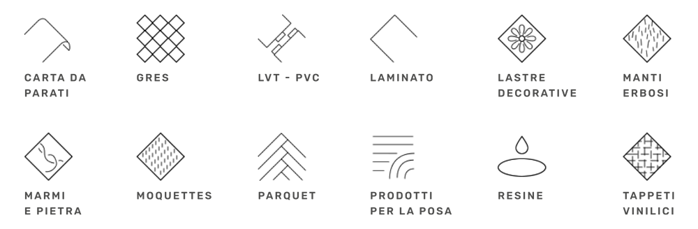
TM Style is a commercial holding working in the flooring and coating sector, both public and private, usually with a very wealthy and demanding client base. The sold materials and the products are multiple:
THE REASON BEHIND THE RESTYLING
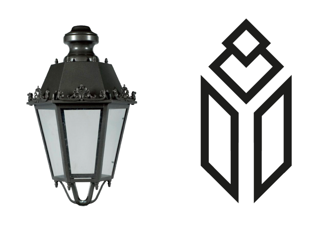
The company was born as a low profile one and then became a solid reality. At first, a logo with the shape of a lantern was adopted. Something very distant from what is usually seen in their sector, where logos tend to have a more minimal and formal style.
In view of the website restyling that was still being finilized when we met, there was the need of creating a logo following the style of this communication tool. Something more related to the commercial category at stake from the graphic point of view.
THE STARTING POINT
The initial logo was not considered suitable to the new restyling project. It was an old idea to be thrown away in order to restart with something new. It was a huge temptation.
However, looking better at the shapes of the lantern and stylizing its lines, I had to disagree. It was possible to give continuity to what had been done, basically changing the shape: that’s what I tried to do.
TM STYLE – THE LOGO PROJECT
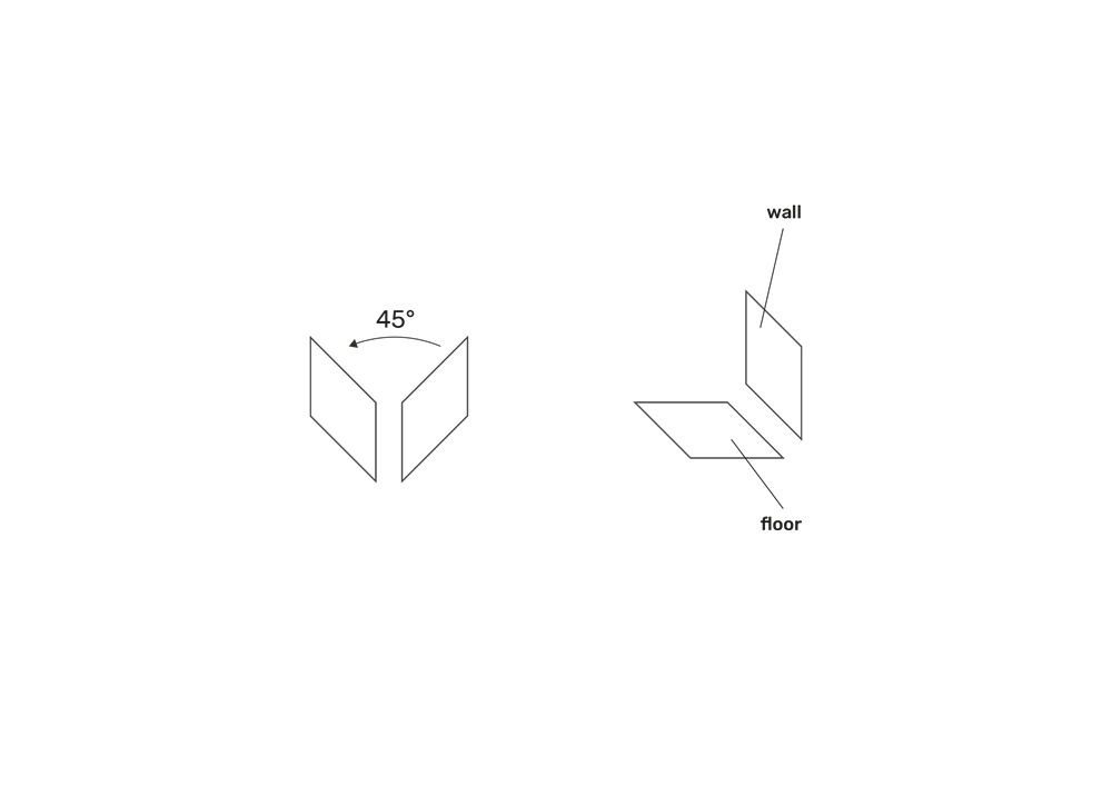
The synhtesis of the lantern can basically focus on its small windows only. At the top of the abstraction, this concept can be represented by two parallelograms set in perspective. This becomes the basis of the actual project of the logo.
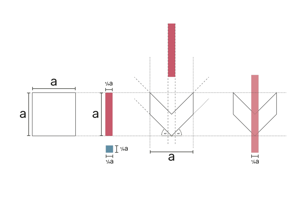
The initial idea was to leave the parallelograms vertically asa reminder of the concept described in the previous pages. However, rotating the shape by 45° we can get one more reference to the commercial sector that we are working with. Two perpendicular planes that, together, form the floor and the coating.
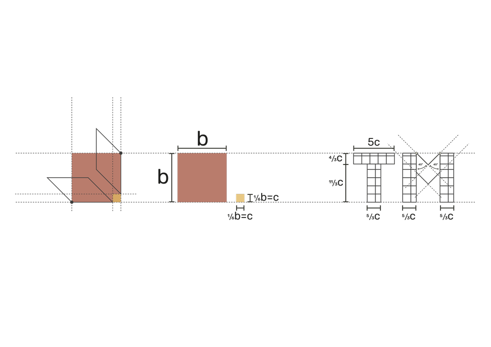
The geometrical logic at the base of this logo is mainly provided by a square. This is formed by the intersection of the extensions of the two sloped parallelograms’ horizontal and vertical sides. From this regular shape and its related submultiples the construction of the remaining shapes can start.
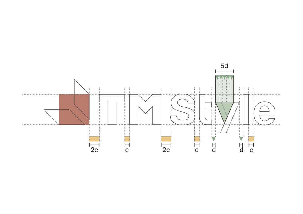
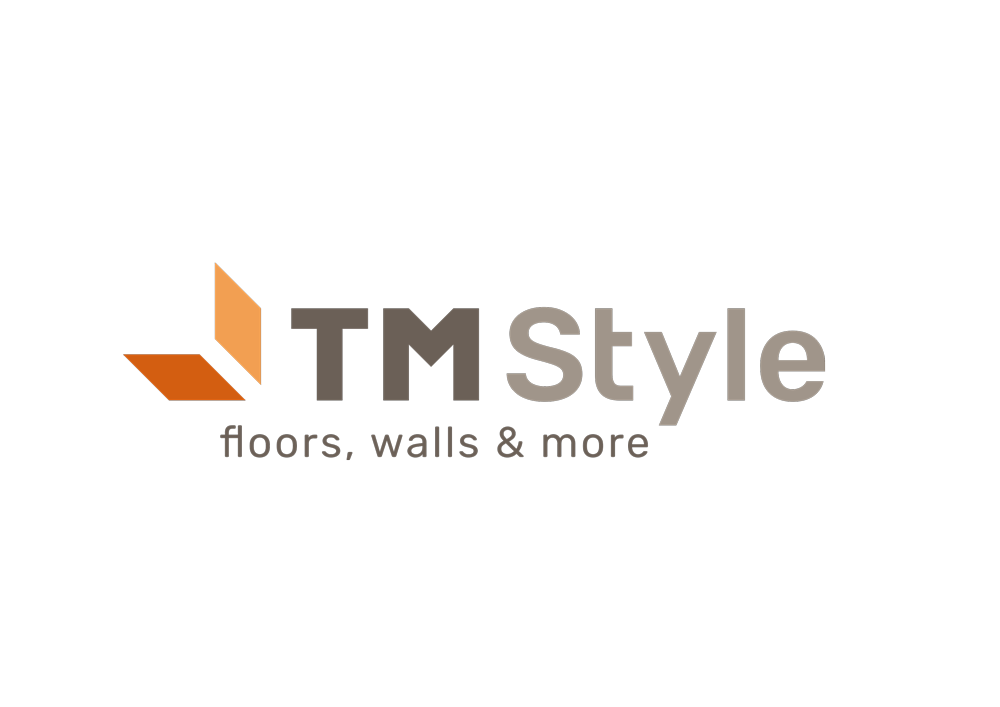
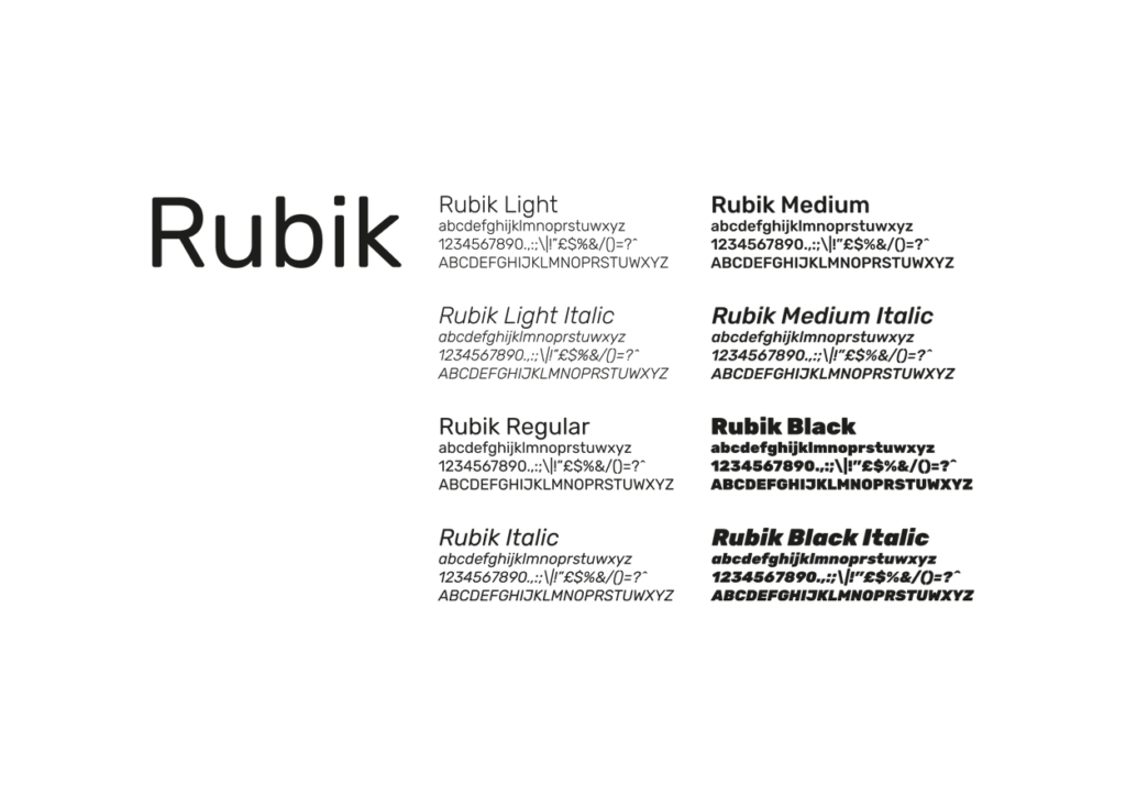
The payoff and the initial font of the logotype are Rubik, one of the last Fonts made available by Google® for free. This is going to contribute to the construction of the brand’s identity for TM Style.
TRADEMARK’S USER MANUAL
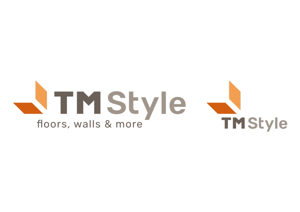
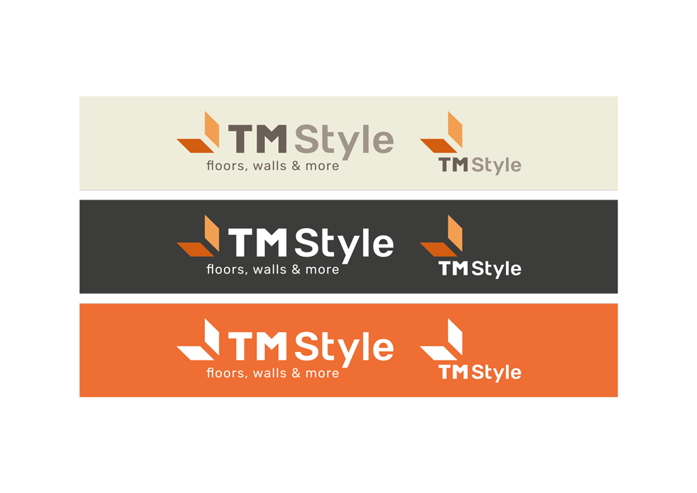
ONE LOGO, TWO FORMATS
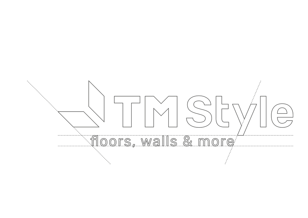
The first version of the logo is horizontal. The seocond one is without payoff and it was created for social media pictures and possible special employments on paper in case of need (for example “narrow” logos in sponsorships).
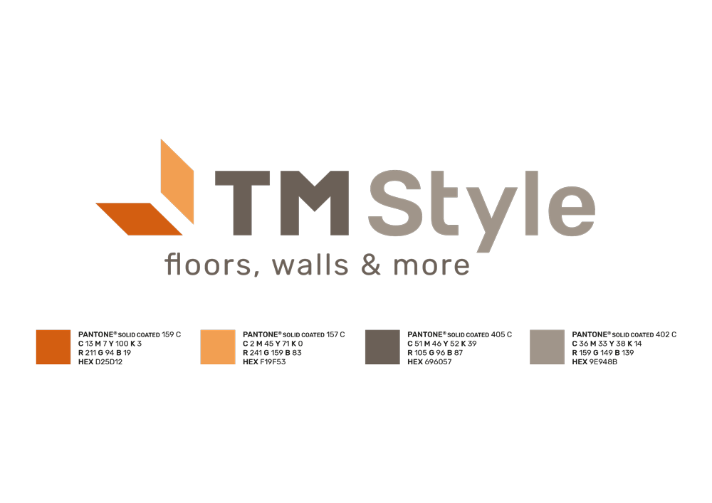
THE LOGO’S COLOURS
The trademark is defined by 4 colours. The pictogram, consisting of 2 rhombuses, has warm colorations to recall the light of the lantern. The area of the “floor” it’s darker because it’s in the shadow, while the “wall” is of a brighter orange. In this way the colour gives a further three-dimensionality to the trademark, dignified by a dove gray for the logo and the payoff.
APPLICATION OF THE COLOUR’S LOGO
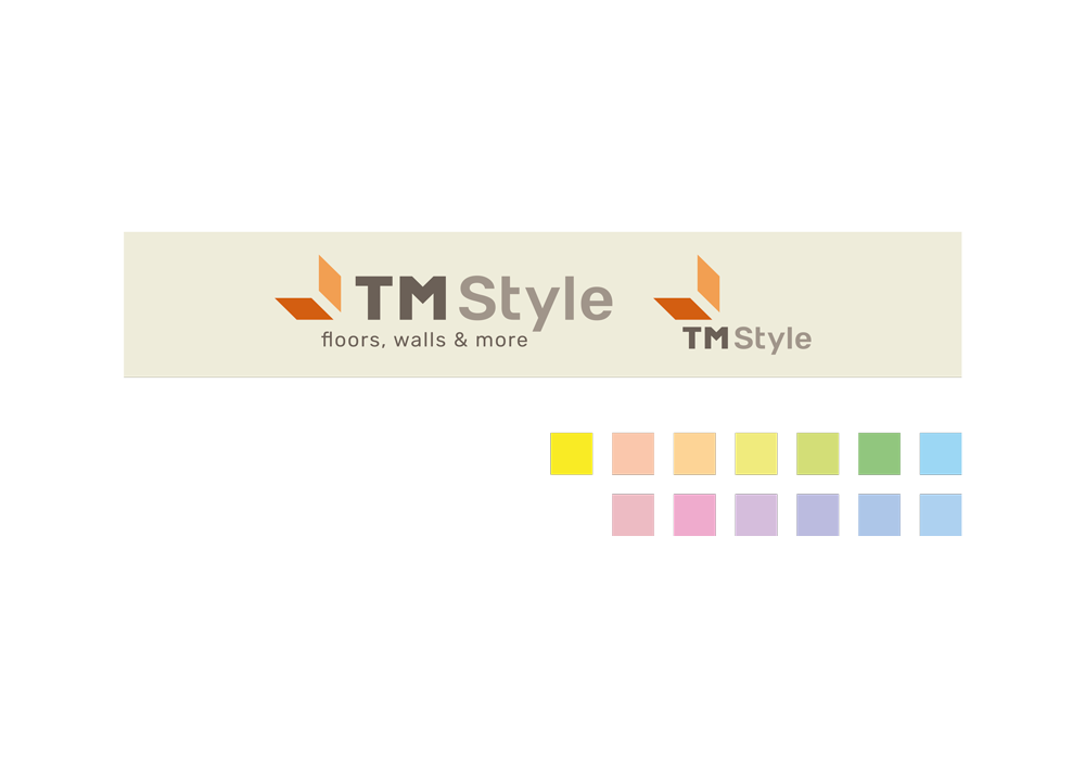
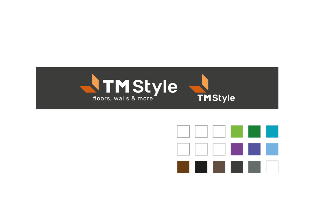
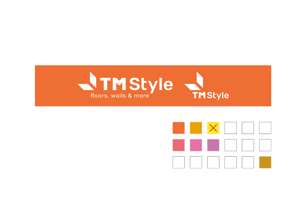
The logo will have 3 variations of colour to use according to the background’s colour. The first version has got positive colours, the second one with a positive pictogram while the rest is negative and finally a completely negative one. The basic rule to choose the right trademark is the following: the negative version must be avoided when possible.
EMPLOYMENT OF LOGO’S COLOURS 1
The positive logo must be used on light, pastel, soft grey, white and strong yellow backgrounds.
EMPLOYMENT OF LOGO’S COLOURS 2
The logo with the coloured pictogram and the negative logotype and payoff must be used on backgrouds with intense colours in contrast with the pictogram’s ones (not orange, red and fuchsia). These logo’s colours are also ideal for silver or dark metal objects.
EMPLOYMENT OF LOGO’S COLOURS 3
The negative logo must be employed on bright shades of colour similar to those of the pictogram and on bronze or gold-plated metal objects. Intense yellow shall be avoided.
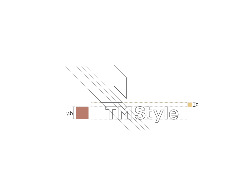
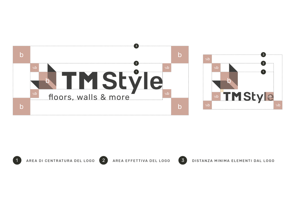
SPACING OF THE LOGO
The distance between the elements of the logo, both the horizontal and the flattened one, is always defined on the basis of the square. The one constructed by the intersection of the vertical and horizontal sides of the two sloped parallelepipeds.
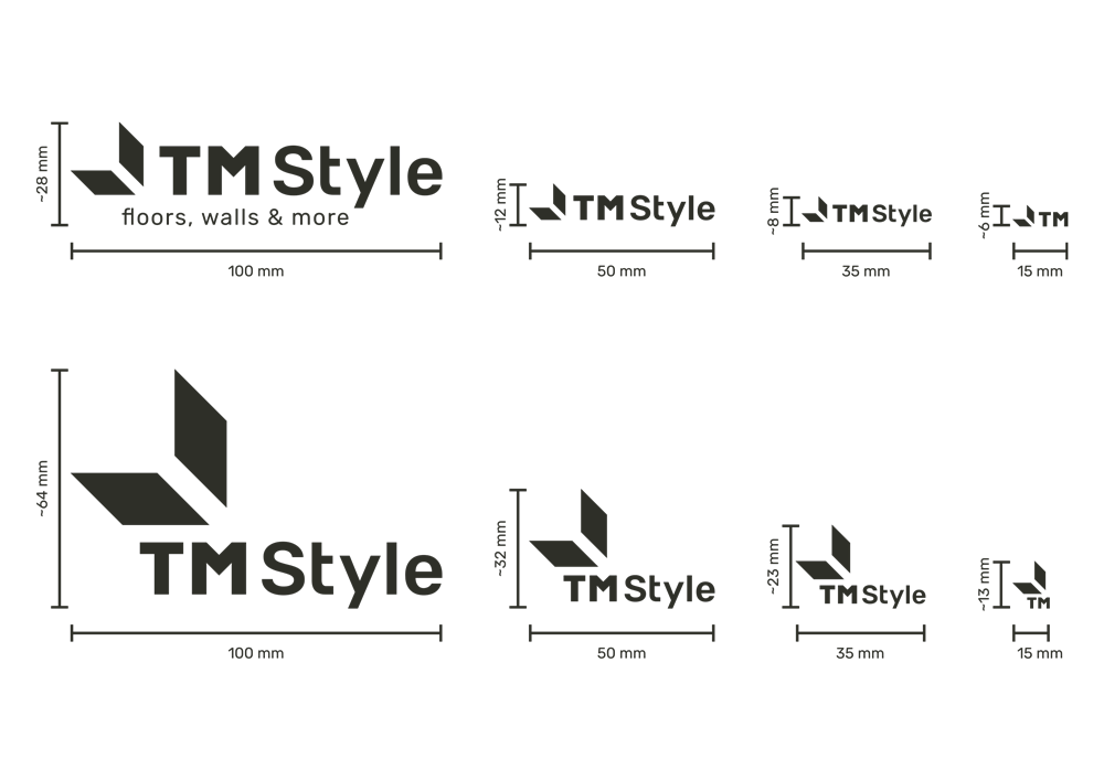
DIMENSIONING OF THE LOGO
The minimum dimensions of the logo are shown below. It is remarkable that reducing the dimensions, also the elements present in the logo itself change. This is due to reasons of visibility of the elements.
THE LOGO’S INSTITUTIONAL FONT
Rubik is a web font provided by Google Font for free. Google Font is an online portal from which one can download Fonts that are perfect both for paper and online use. They are all compatible with every operating system and with many available glyphs (typefaces).
Rubik has some very peculiar characteristics, even though it really resembles a Sans Serif, the slight rounding of the edges provides an informal and unique look, making it incredibly versatile.
The contents of this document is confidential and is intended solely for addressee. The information may also be legally privileged. This transmission is sent in trust, for the sole purpose of delivery to the intended recipient. If you have received this transmission in error, any use, reproduction or dissemination of this transmission is strictly prohibited. If you are not the intended recipient, please immediately notify the sender by reply e-mail or phone and delete this message and its attachments, if any.