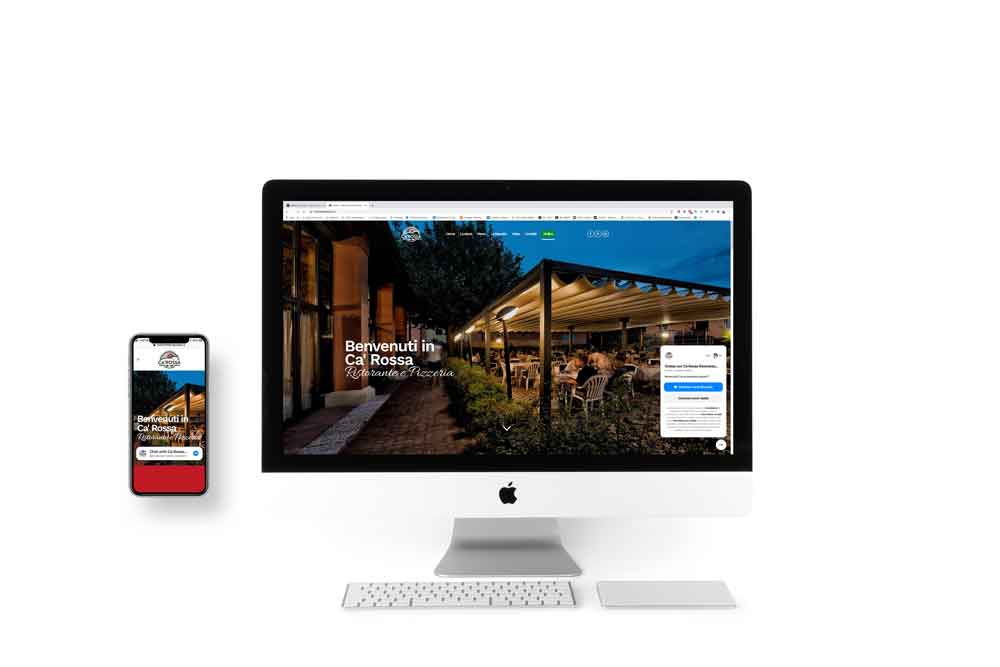
The realisation of the Ca’ Rossa Logo was born to give new life to a renowned restaurant in the Reggio Emilia area passed down from father to son. It was on the initiative of Marco Ferrari that I started to work on this new project. I have immediately appreciated his enthusiasm, his desire to give back his experience in marketing and food service to his own homeland.
The project
The aim of this project was to create a brand that could recall Italy and the rusticity of an old restaurant and that at the same time could express refinement and quality, the objectives of the new owners.
Simplicity at the base
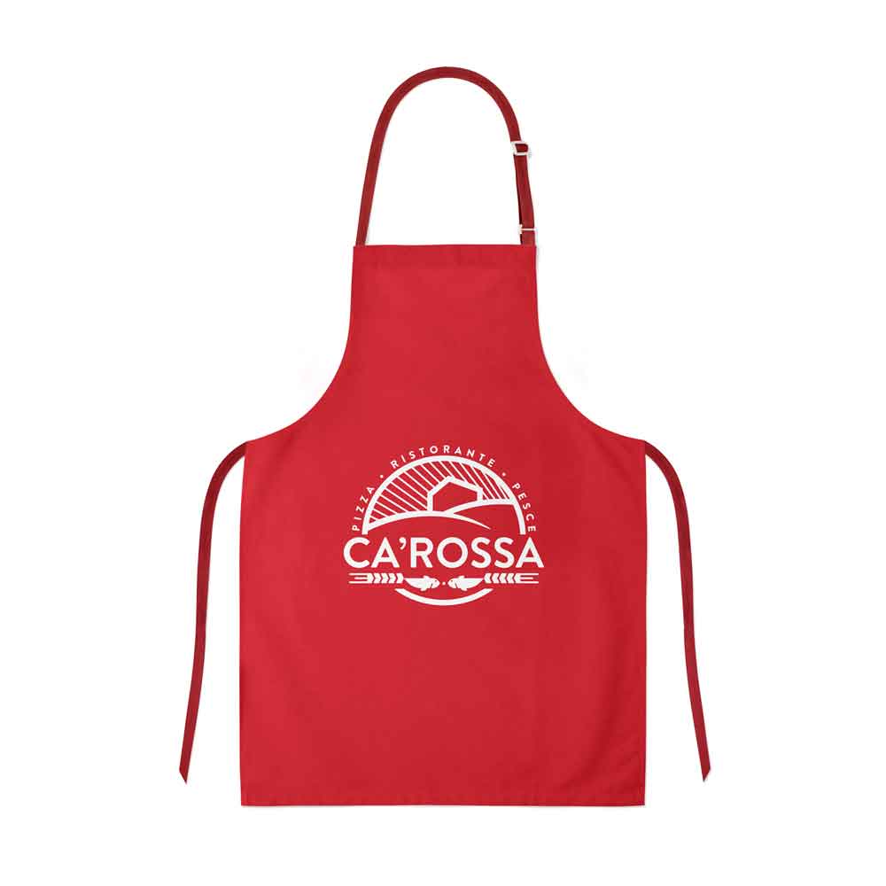
Everything was born around a very simple concept: an essential and recognizable logo. This is why particular attention was given to the design of basic but appealing shapes that could attract the eye on a few fundamental details: the red house and the name of the restaurants.
The thickness
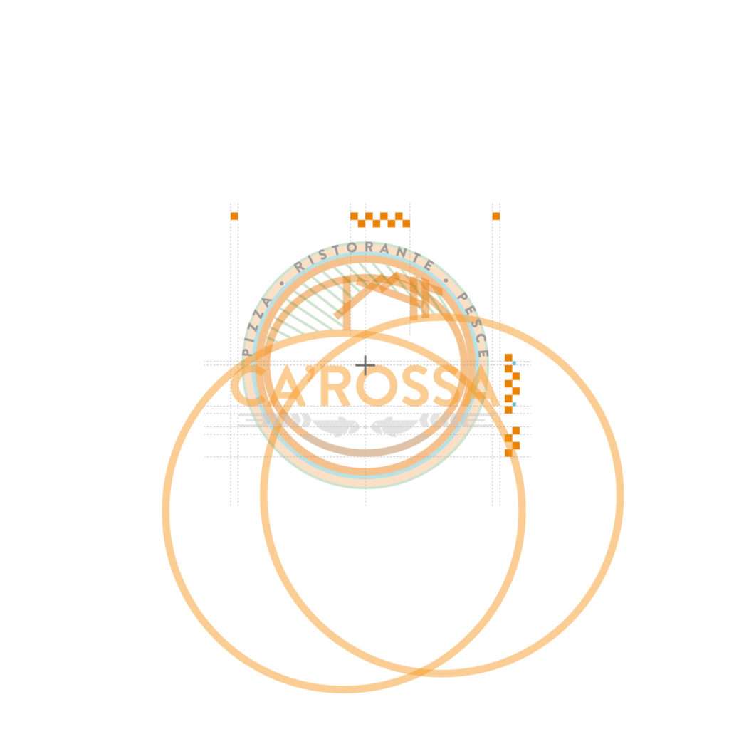
3 proportioned kinds of thickness are at the basis of the traits that we are going to apply to most of the elements included in the logo.

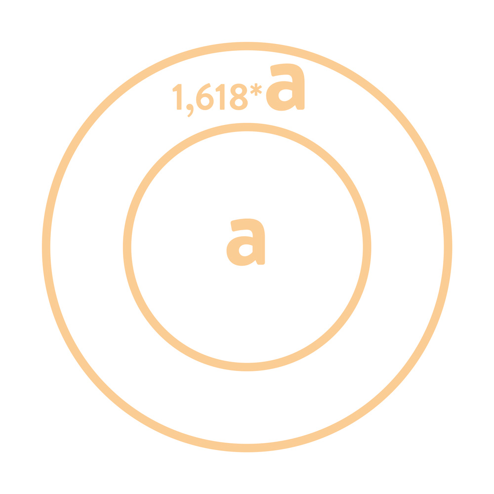
The golden ratio
Stylistic curiosity: the circumferences that will be used to create the hills on which the restaurant will be placed have a proportion based on the golden number 1,618.
Fish and ears of wheat
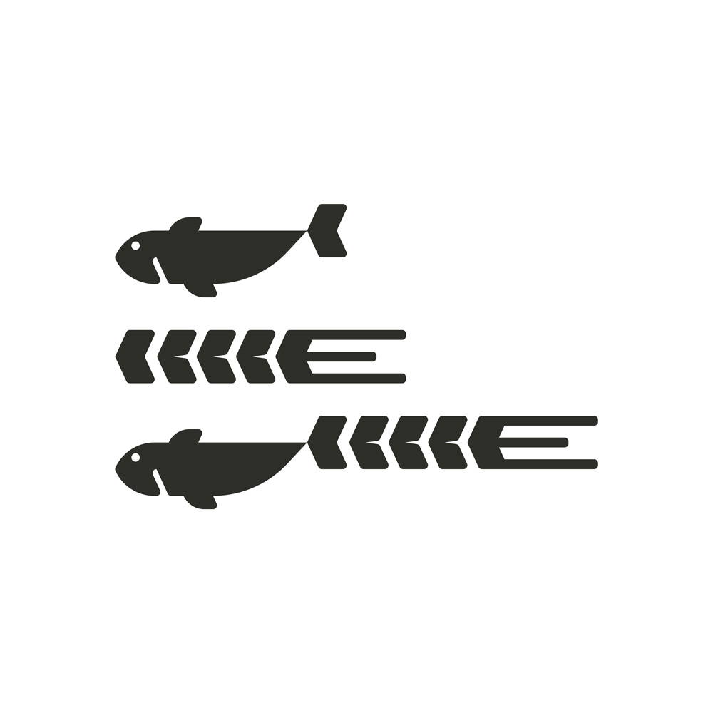
The logo had to recall the presence of pizza, fish and vegetarian dishes in the menu. Therefore, I decided to join the elements in a sort of iconic frame that I inserted underneath the main text.
The bridges of Reggio Emilia
In order to give a more “Reggio Emilia” touch to the illustration, I decided to insert a series of rays in order to recall the famous arches of the Calatrava bridges, easily visible at the entrance of Reggio Emilia.

The design
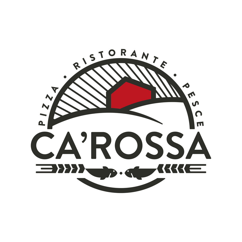
I Colori
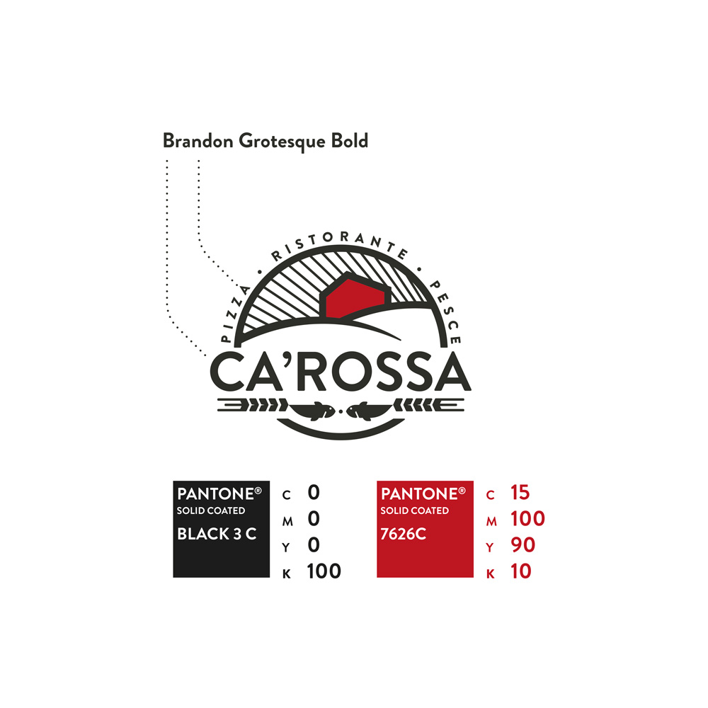
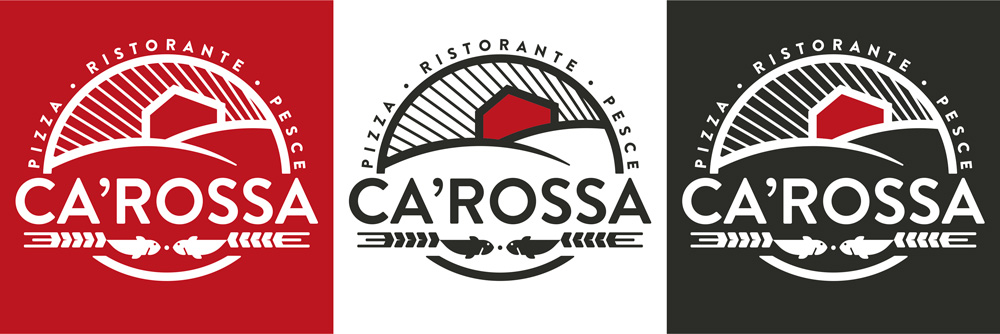
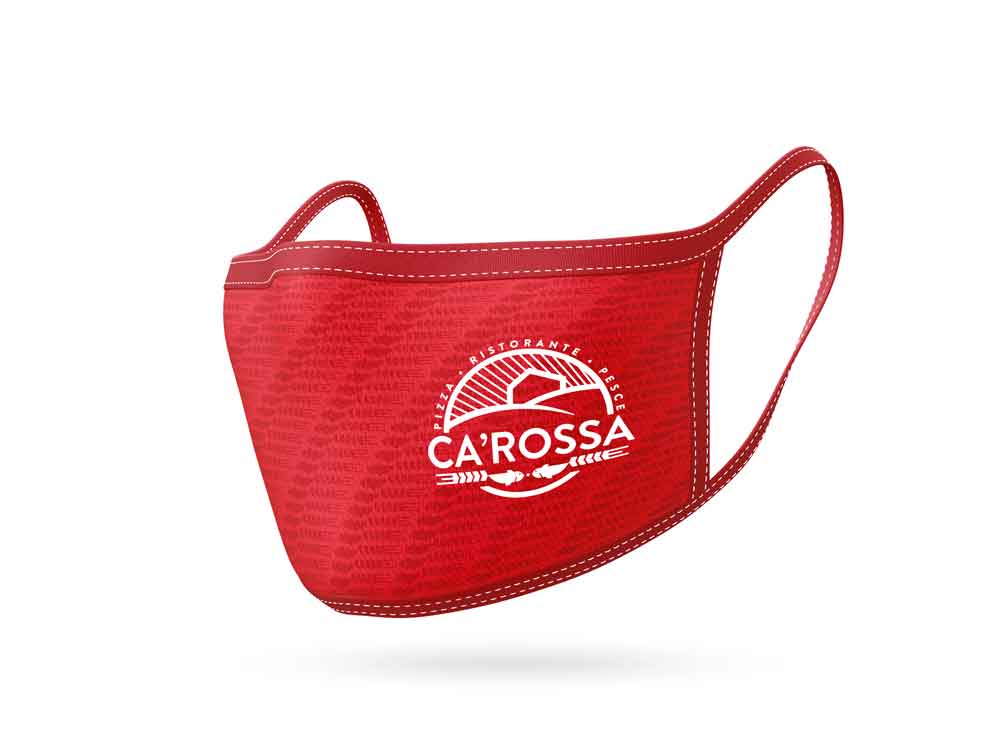
Protagonist of the compostition is a bright red in strong contrast with the other elements of the logo, all black. This is made to visually emphasize the presence of a Red House (translation of Ca’ Rossa).
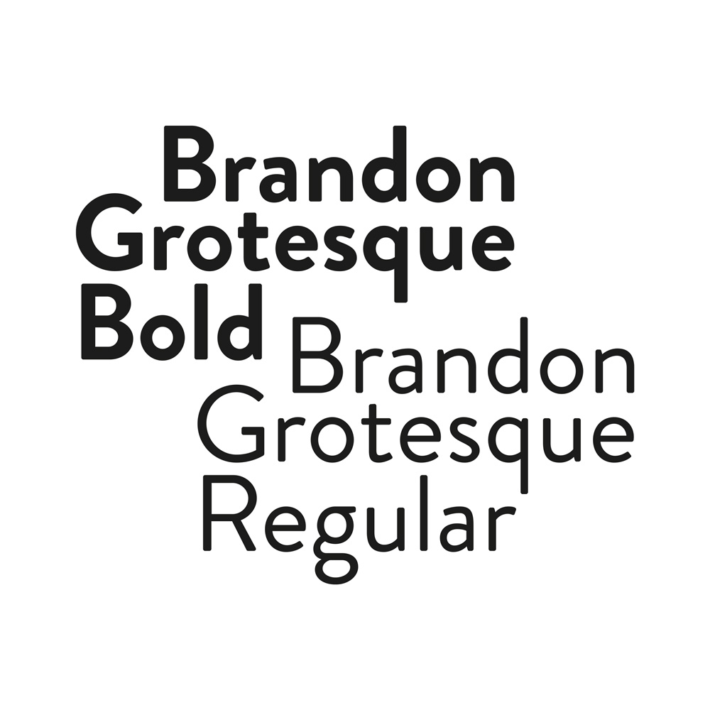
The Font: Brandon Grotesque
The use of Brandon Grotesque meets the design needs for the logo. A font that could recall the typographic elements from the first half of 20th century, together with a more modern style. A sort of a bridge between past and present.
Di you like this article? If so, you might be interested in other articles about logos! Take a look at Formigine Volontaria, Taste Bologna, Movimente or TM Style!

