Ceramics came into my life without me noticing. In my huge ignorance, until the age of 22-23 I wasn’t even aware of the fact that the area where I live is one of the most important ceramic districts in the world, I couldn’t even imagine that this district had an impressive number of activities linked to the visual communication.
I’ve understood that by entering a communication agency, starting to crank out synoptic tables, fliers and catalogs for fairs and exhibitions over and over again, for years. However, finding out the ceramic photo matching was the most surprising thing to me.
BETWEEN PROFESSORS AND LONELINESS, LOOKING FOR A METHOD.
From the beginning, my path in the field of ceramic communication was similar to the one of a sailor without a rudder on the high seas. I let other people’s work flows to lead me. Therefore, since I was an humble employee of UFO.ADV I only did everything I was told.
Finally the day came when they asked me to do photo matching. I started with the help of the trustworthy Barbara and the reccomendations of Paolino from Altervista. I began with small things, outlines, the first light and shadows effects and reflections. I became independent in a short time, reaching very interesting results. Above all, I could perfect a standardized work method that I still use with every image I work on.
Below I’m going to list these forced stages. Obviously they are not going to reveal every secret that I own (small diabolic laugh). They are just going to provide a kind of modus operandi, the result of commitment and improvement over time. Something that allows everyone to save time. Both those who work on rooms and to the most demanding customer in constant search of changes.
MAXIMUM REVERSIBILITY
At the base of my method there’s the possibility to maximize the reversibility of every stage. In this way, it’s possible to accommodate the costumer in every step of the process in case modifications are needed.
The best way to do this is to make the most of Photoshop’s potential, treating every image almost as a craftwork. However, to define oneself as an artist when working on this kind of things doesn’t really make sense. It’s not an artistic or creative process, the aim is to obtain a photo-realistic result (hence standardized) thanks to a good knowledge of the available tools and thanks to as much obsessive precision as possible. Obviously, there’s a personal sensitivity involved like in every handcraft work, but everything is included in an extremely rigorous procedure which it’s better to follow.
AT THE COSTUMER’S SERVICE, WITH FRANKNESS
To deal with this artistry, every personal choice is better to be avoided in favour of the costumer’s ones. This doesn’t mean not to say anything even in front of absurd requests. Instead, it means to provide consultation with the right serenity and without sticking on something if you realize that on the other side there’s no possibility of changing ideas.
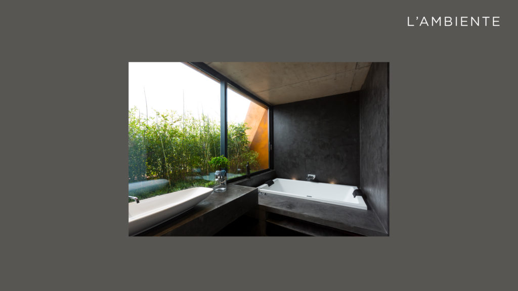
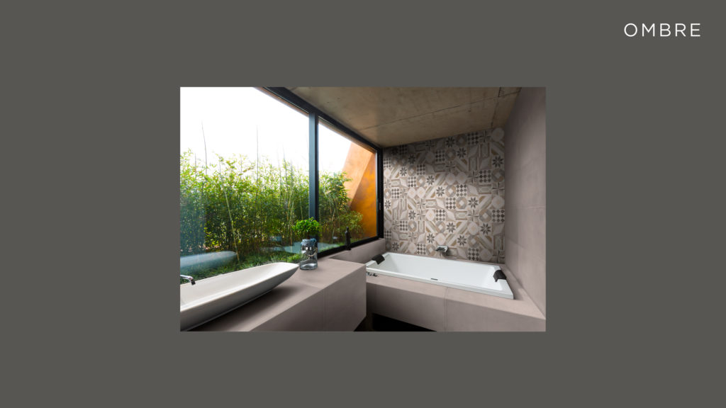
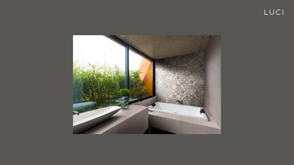
THE ORIGINAL SPACE
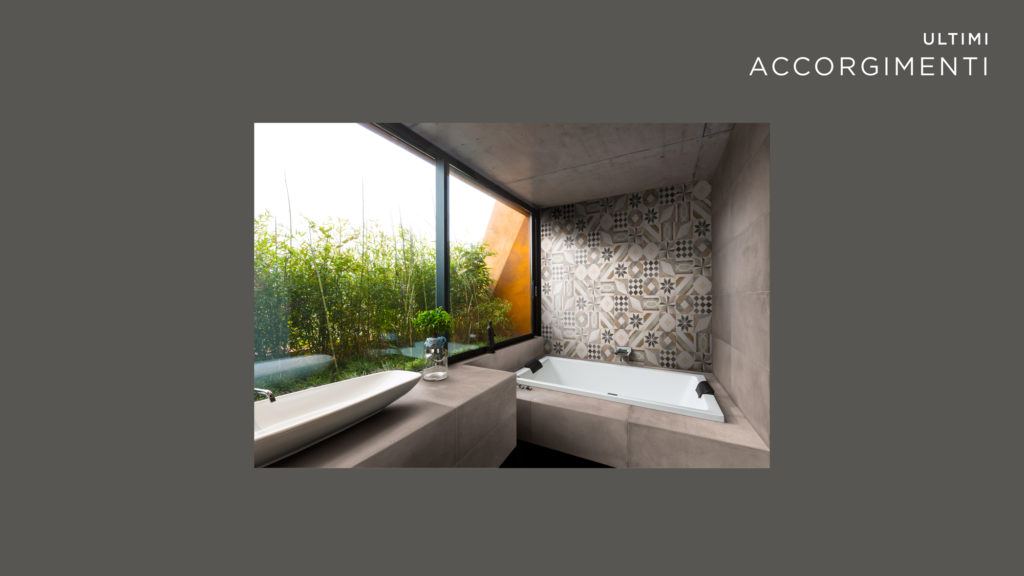
Let’s consider a bathroom with different surfaces to be changed, all connected to each other. The costumer asks us to place a cement-like product on every visible area. This represents a small nightmare for every photo-editor because it forces you to be incredibly precise in taking measures of every dimension of the space in order to fit all the formats that the customer wants to present in the image. Regardless of this, every space needs to be observed carefully from the beginning to understand which problem could rise up in the following stages.
First of all, care must be taken to perspective and size of the room. If the image immediately turns out to be excessively quadrangular or it shows extreme optical deformations, it’s necessary to operate on it to “reset it upright” before the installation of the tiles. Another important aspect is the type of light in the room. Coloured light is a bummer if you want to make the natural colour of the tile to stand out. Therefore, oneshould avoid vintage style-photos, neon lights or coffee shops lighted up by incense burning braziers.
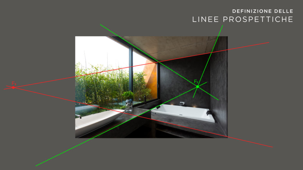
THE PERSPECTIVE
An inevitable part of creating panels prospectively aligned to the original space. Once we obtain one or more points we can already get an idea of how flattened and distorted our products will be once placed.
We can get those points quite easily; we have to indefinitely draw the straight lines that we find in the image. As you can see it’s relatively banal. Anyway it’s important to be careful and link straight lines quite distant from each other in the picture. In this way one avoids as much as possible the deformation due to the lens used to take the photo.
Different considerations must be taken with 3D. The rendering produces images with a precise perspective and without the optycal effect typical of photography. You only need to train your eye to understand what you have in front of you when you see the image (it is often quite easy to understand the difference).
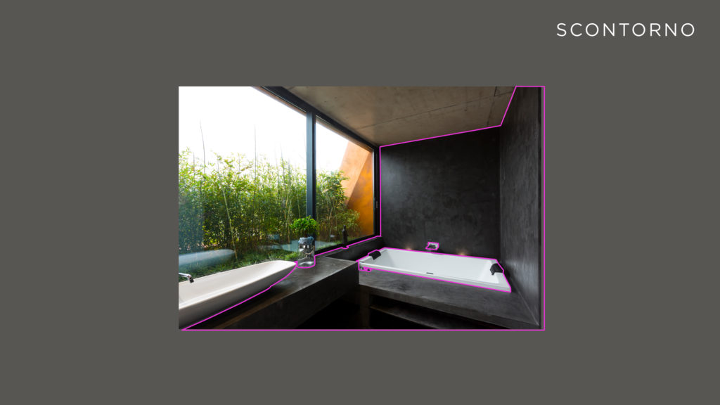
THE CUT OUT
The cut out consists in “cutting” out the sensitive area of the picture where we are going to place our tiles. It’s possible to do this in a thousand ways, using the pen, the clipping mask and even the polygonal lasso. What’s important is to be terribly precise and not to forget the small details which will result as a real eyesore to a keen eye. This first stage of cutting out might be followed by more specific ones, for example involving objects that will later go in upper areas of the tile, in transparent glass etc…
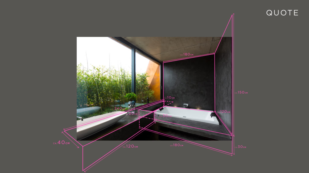
THE MEASUREMENTS
The measurements are a very delicate topic, because on them it depends the subsequent laying and the spacial accuracy of the product that we’re going to place (essential for those who have to sell the tiles in a picture to a potential buyer).
Everything is based on the knowledge of the dimensions of the furniture in the picture, according to which it’s possible to measure everything else. Interesting hints that could help us are the ceilings, the presence of other tiles of which we can define the size, windows and doors, friends who are architects, aunty Mary who used to sell armchairs at Ikea everything helps when it comes to specify the dimensions of a space, even (and above all) Google!
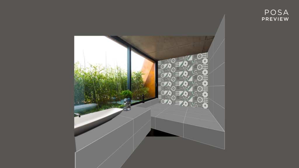
THE PREVIEW LAYING
The preview laying is obtained by reconstructing the laid product with rectangles or other reconstructed shapes in real size with Illustrator and then putting them together on the original photo with Photoshop. This provides the costumers with a very useful preview image, because through this they can quickly understand the dimensions and the proportions of the tiles towards each other and towards other elements in the photo. Just as quickly the client can get new previews in case there were changes to be made to the first version. This might sound banal, but after never-ending worries, making and remaking panels of incredible virtual heaviness, I understood how much a preview phase was necessary in order not to end up going to therapy too soon.
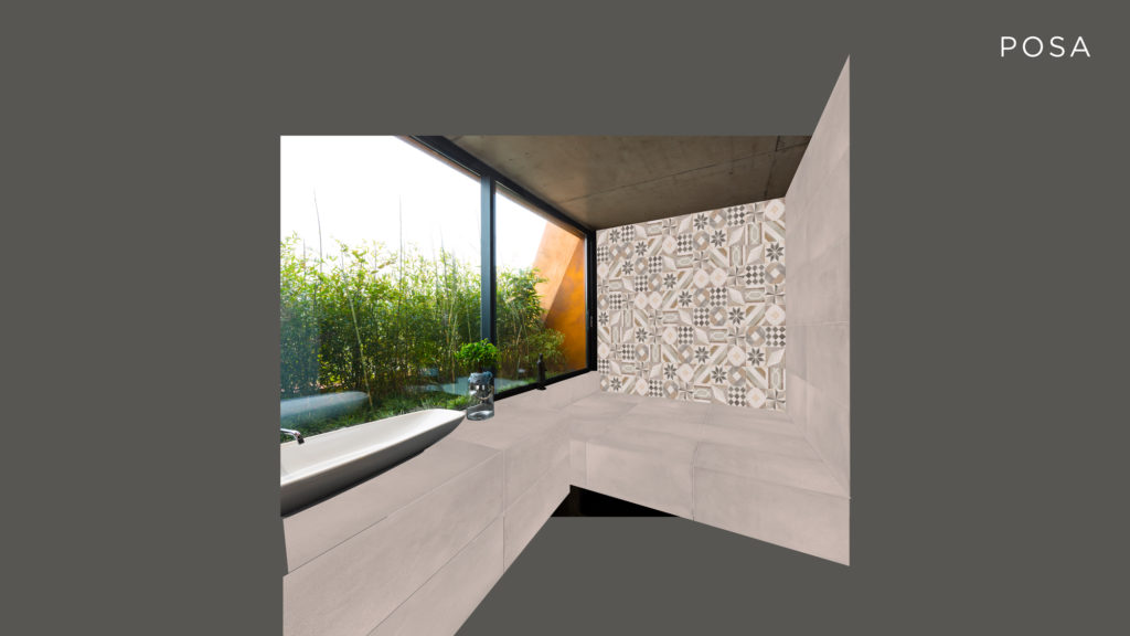
THE ACTUAL LAYING
Once the preliminary laying has been approved it’s possible to proceed to the laying of the actual products. Something very important at this point is to take into consideration the available graphical views of the products, in order to make the panel’s distribution as heterogeneous as possible.
The panel must be constructed in a separated file. It’s made of all the facets of the products that we are going to place, as long as the customer doesn’t have any issues with the graphical views. There are multiple ways to create these panels. Personally, I think it’s essential to create files of manageable size (we’re talking about gigabyte) and without the tile joint. Usually I do that through a separated level in the photomatching picture.
Many people tend to put the tile joint and the placed panel in the same file as the panel itself, then they copy and paste everything in the photomatchig. However, by doing this they lose the possibility to apply a slight smooth effect to the tiles which will appear embossed compared to the joint, a touch of class I believe…
SHADOWS
The next step is the shadows’ application, which must be done remaining faithful to the lights of the original space. How to get that? There are several schools of thought about it. Some people do everything with the brush tool, others try to get it from the original space and some call a painter friend in help. In my opinion, it’s right to draw from every discipline. What is important is to obtain one or more well defined and reversible shadows’ levels.
I want to be clear: the lights/shadows/reflections’ phase doesn’t have a proper schedule to follow. It’s extremely linked to the lights of the space and to the kind of advertised product. Usually on opaque products priority is given to shadows because they need a more thorough job compared to lights and reflects. On the other hand, honed or shiny products require us to study the reflections primarily. This a real challenge for every professional photoshop user because reflections force us to recreate the various areas of the space mirrored.
LIGHTS
As above, one must faithfully comply with the environment, trying to have special consideration for the kind of surface and the colour of the placed product. Usually the lights are a sore point for the customer because they tend to mask the product even more than the shadows. It’s up to you to decide to what extend “stand up” to the client’s incessant desire to relieve the light effects, because it’s right to care about the truthfulness of the space even besides your client’s will.
THE STRUCTURE
To structure the ceramic product means working on the contrasts, applying masks, creating light effects using sepcific brushes, accentuating the lights in specific areas of the tile… basically everything that goes through the customer’s mind, and everything that could make the product as similar as possible to the real one.

LAST PRECAUTIONS
One of the last things to do, besides getting paid, is the color balancing between the placed product and the light of the space. This is a crucial step to make the picture uniform. In fact, without paying attention to this, the space could result detached from the inserted image, defeating the good work done so far.