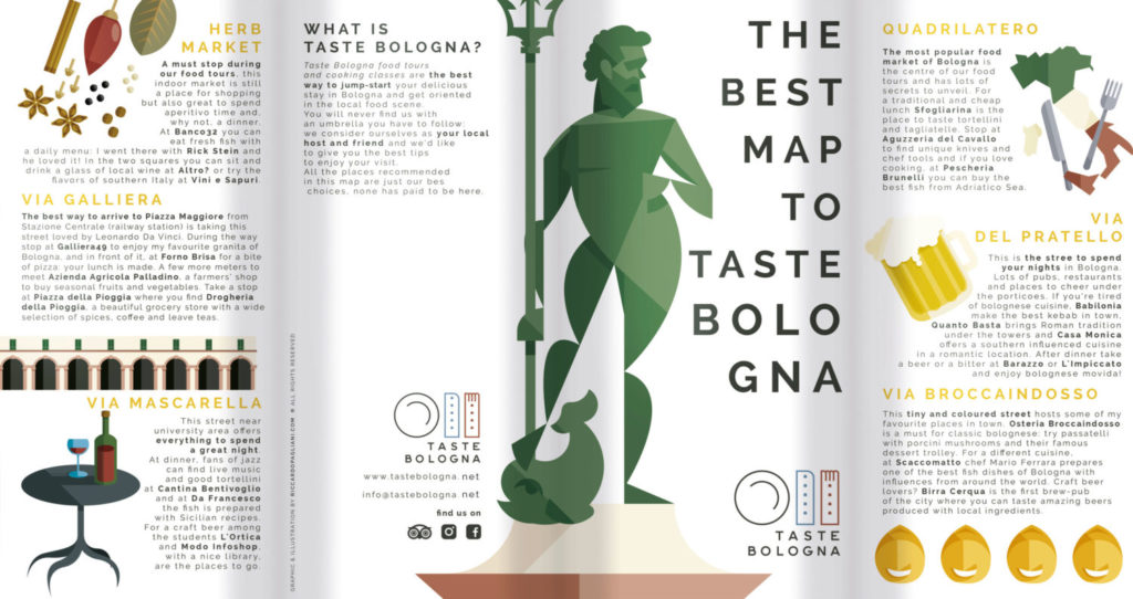
TASTE BOLOGNA is a tour operator that you can book online. The travelers who choose this service will be totally surrounded by the Bolognese reality, they will discover the most typical places where to eat, they will get to know the traditional dishes and the people of this wonderful city.
Andrea, the owner and a friend of mine, asked me to design his brand after several unhappy attempts with other graphic designers. Probably he liked my approach to the project because it was different than my predecessors’ one. Obviously, I couldn’t ignore a few typical elements from Bologna, but at the same time I wanted to find a visual synthesis with the concept of food, a fundamental focus for Taste Bologna activity.
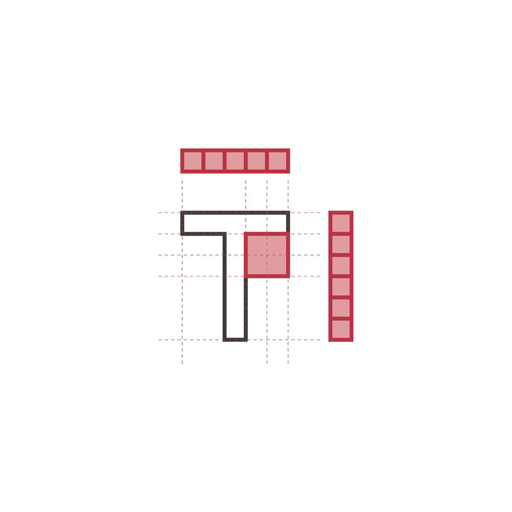
I turned the two towers into a fork and a knife, I added a plate and created a very Italian logotype using a Gotham Font. In this way I created a trademark that was both traditional and youthful at the same time.
Particularly noteworthy are the colours. Brick red and light blue to recall the official colours of Bologna.
The starting point of the planning is the tickness of the letters. I used it as measure unit in order to take perfect proportions between all the other elements of the trademark. An interesting thing to underline is the position of the plate on the left of the cutlery. That’s where it must be according to the etiquette. The fact that in this way the design is even more balanced it’s nothing but a detail.
In the beginning the font was a Gotham Bold. Later, I worked on it to make it more geometric and similar to the Italian typographic school of post World War One, very close to futurism and the avant-guarde of the beginning of the 20th century.
Three trademark’s colour variations: positive, negative and total white. The choice depends on the background on which it will be used.
The institutional font chosen for Tast Bologna is the Raleway. A Google® Font open source perfect for web application and suitable for the Taste Bologna brand. In order to make it more interesting and fancy I decided to leave greater space between the letters, making it wider, emphasizing each letter, without affecting the reading.
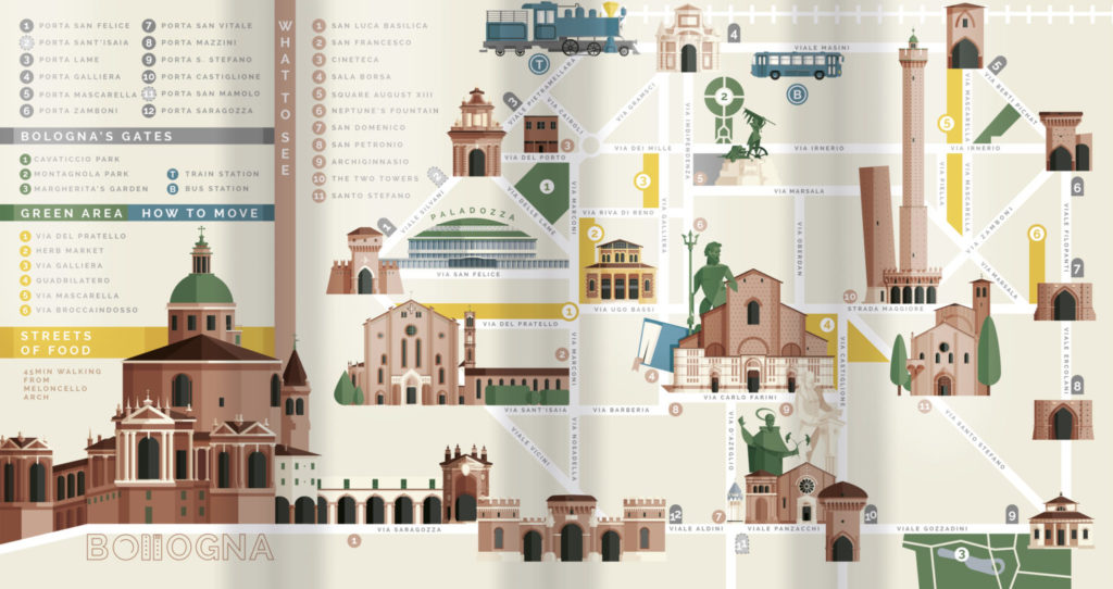
At the end of works, Andrea commissioned me a gift to be released to all his customers at the end of the tour. Actually, he already had the idea in mind. He wanted to create a map of Bologna, we took a look to other examples of it and I decided to accept this project, also as a matter of personal experimentation.
Creating the map drove me crazy, but I think I made something that Bologna had never seen before.
I started to draw the map trying to pay attention to all the streets, but the more I worked on it, the more I understood that was too complicated, cahotic and inaccurate. I talked to Andrea and he suggested me to synthesize everything in very simple shapes, taking just vertical, horizontal and 45° streets (like a subway) and using just the streets we needed. I started from his idea and applied it to the project creating something way simpler and more accessible. Finally, I added the geometric illustrations of the historical buildings of Bologna.
Without false modesty, the final result turned out to be very cool.