INTRODUCTION
I love to give myself a morning of inconclusive work on Christmas Eve. For this reason I’ve decided to throw myself into the restyling of the U.S. Sassuolo Calcio brand, hoping that it could have become something more than a simple project… where did this crazy idea come from? From the fact that yesterday I’ve been to the Mapei Stadium to watch the Sassuolo’s triumph against Internazionale Milan (my other beloved team). The tickets I was given, almost as a birthday present, allowed me to watch the match so close to the VIP area, that when coach Iachini was expelled I’ve found him behind me, with my greatest joy.
My attachment to the black-and-green colors pushed me to follow this team since when they were in Serie B. However, since slippers have always attracted me more than the cold bleachers of the stadium, I preferred to subscribe to Sky Football, in order to follow my favorite players while collapsed into my comfortable couch.
What I’ve always admired of this club is its societal project, the provincial but ambitious dimensions, the players’ quality. Everything but the logo. I’ve always considered it one of the ugliest of Serie A (besides Benevento).
So I decided to clean it up by simplifying its shapes and giving more balance to its constituent parts. Whilst always remaining true to the original logo.
THE SHAPES
I decided to start from the golden ratio in order to analyze the main shapes and then calibrate the secondary ones and the main lines as a consequence. Subsequently, graphic elements were introduced. Even though they seemed to be quite external to that logic, in their proportions they actually recall the same planning design.
SIMPLE SHAPES
The Scudetto (a small shield) is the basis of the original trademark and it’s extremely complex. The original wish was probably to draw inspiration from the Premier League football heraldry… but apparently something went wrong.
Since I’m quite a good fan of British football I decided to search for a sort of sinthesis between those shapes and a more Italian and strict logic of last century. I designed something in between those two characteristic but still linked to the original logo of US Sassuolo.
THE FONT
If there’s one thing that I’ve always barely endured about the original logo, it’s the font. Therefore, I’ve decided to go for something solid and modern like the Futura Bold and to slightly adapt the line to make it more homogeneous with the rest of the logo.
COLOURS
And here it is, in all its damn simplicity. A dry and essential logo, suitable as scudetto and perfect as institutional brand on which it’s possible to build a convincing image.
I have arbitrarily decided to change the green colour by giving it a more pastel shade and to leave the central font black. The white had been bothering me since the beginning.
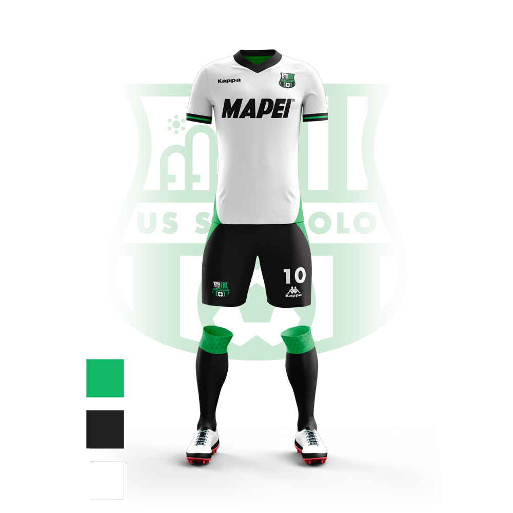
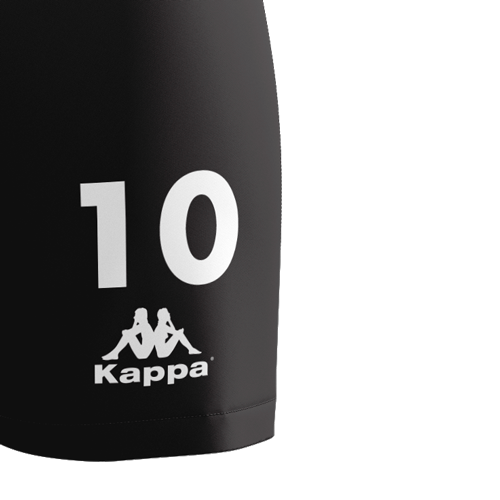
THE JERSEY
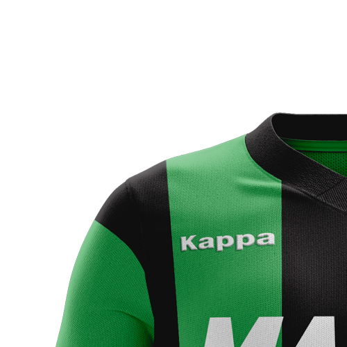
I chose to reinterpret the jersey following the original style but removing many small details. In my opinion they were excessive on a colorful jersey like the black-and-green one.
First of all, I decided to replace the Kappa logo with its negative version to make it more elegant. Besides, I thought it could be interesting to emphasize the Mapei logo since It has always been Sassuolo’s main sponsor. Therefore, I also added the detail of that trademark which appears in a light texture on the socks.
The socks are very simple and elegant too. They include the new Sassuolo’s logo, the Kappa’s negative one in vertical format and the numbers in Futura like the writing “SASSUOLO” in the trademark.
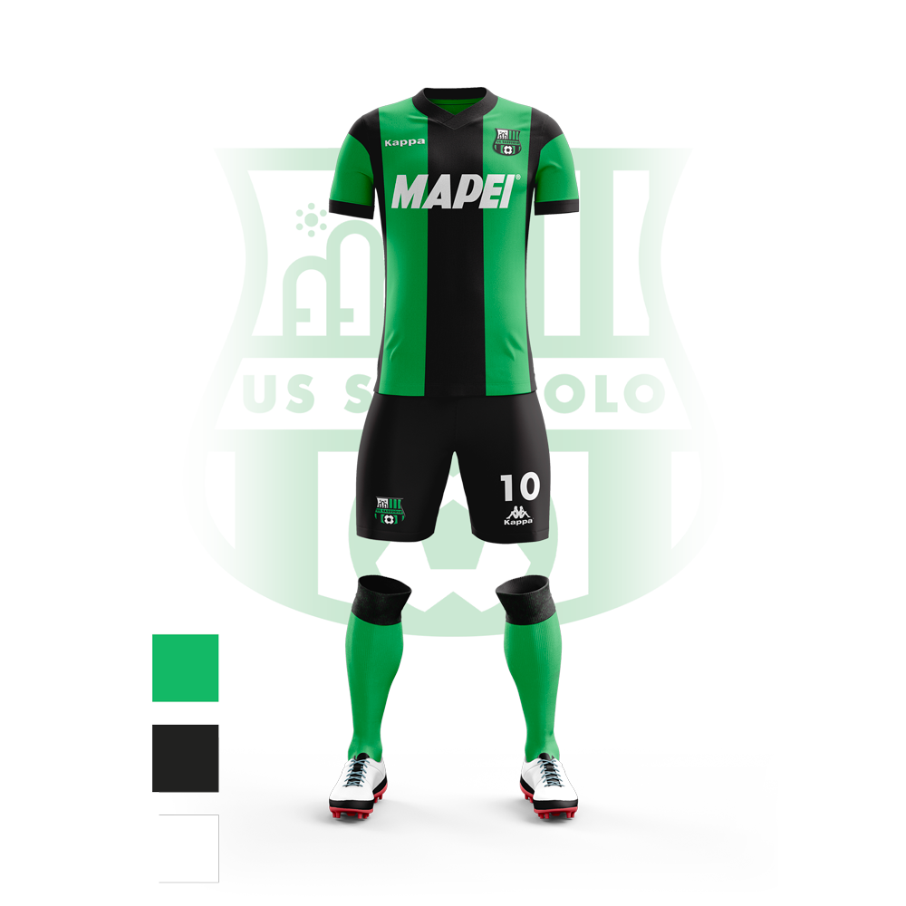

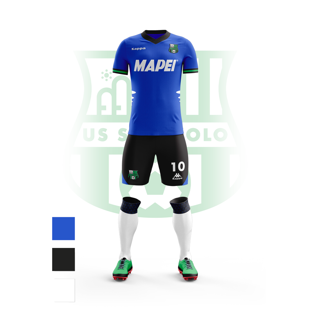
I used a similar logic to create the away jersey and third one. Always following the logics used in the previous seasons as well.