ITA EN

Modena FC Brand Concept

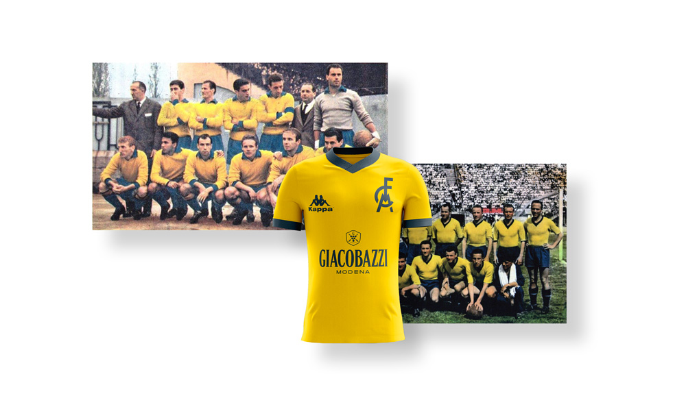
As a graphic designer from Modena, the idea of working on a concept for the Modena FC Brand as always intrigued me, even if it could be just for fun. Therefore, in summer 2018 I decided to dedicate myself to a personal project. Everything began with an Advertising campaing for the born-again Modena Calcio (Modena Football Club) at the hands of Bia Network.

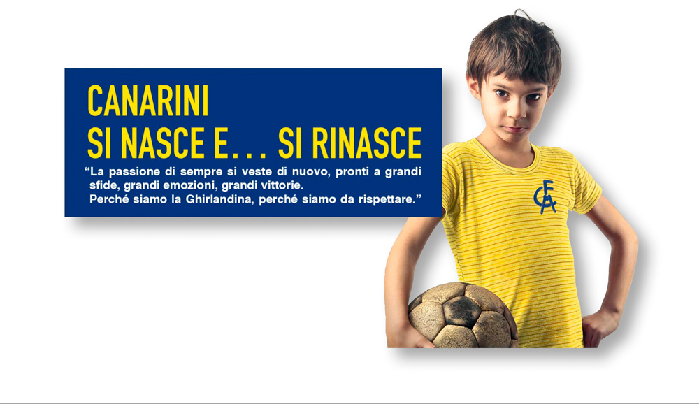
The little boy wearing a yellow t-shirt with the stylized logo that was on the poster of the ticket campaign went viral.

Modena FC Advertising by bia network. Alittle boy wearing a yellow t-shirt with the stylized logo, is looking at the camera with proud eyes and holding a football. Next to him a writing stands out: "Born... and reborn canaries" (Canaries are the symbol of Modena FC, due to the yellow color)

This hint of concept resulted in a t-shirt that didn’t live up to the expectations. This made designers and fans to look for a possible (even if utopic) alternative.
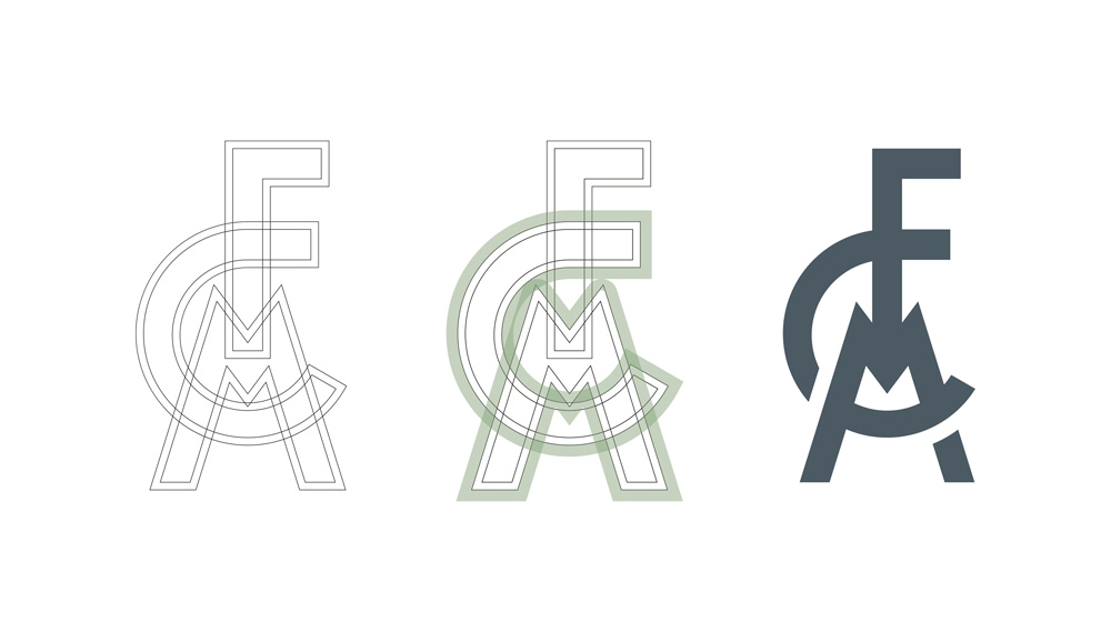
Modena FC, the new t-shirts. The usual kit that includes the home jersey with a yellow t-shirt  and blue socks; an away jersey with blue t-shirt and yellow socks together with a third white suite. The horrible thing is blue or yellow band with Modena FC written in some different fonts.

The new logo

Where to start then? From the brand, obviously. Removing the typical yellow and blue oval, a very minimal and refined brand was created, which is suited to different purposes, other than football.

Comparison between the two Modena FC brands. On the left, the old classic brand with the traditional yellow and blue oval with the acronym FCM on the left and the year 1912 on the right, underneath the writing "Modena Football Club". On the right of the image there is the new brand with the simple monogram MCF without all the other elements.

Here you can see a slight redesign of the actual logo with more evident link between the letters, without distorting the traditional look.
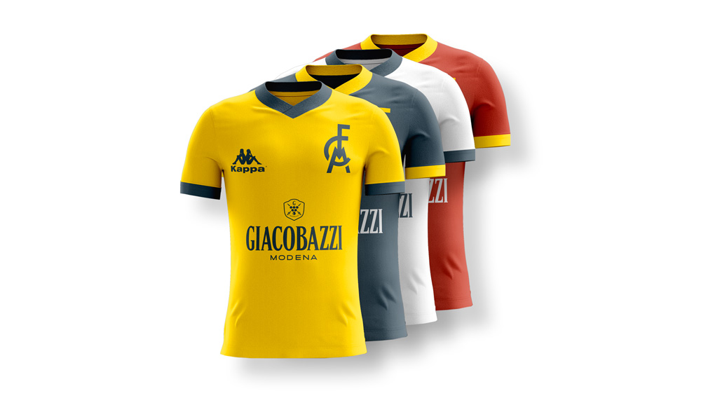
Restyling of the Modena FC brand without all the surrounding elements around the MFC acronym, which was made way more regular and geometric. The color chosen is a vintage and refined blue.

The new colors

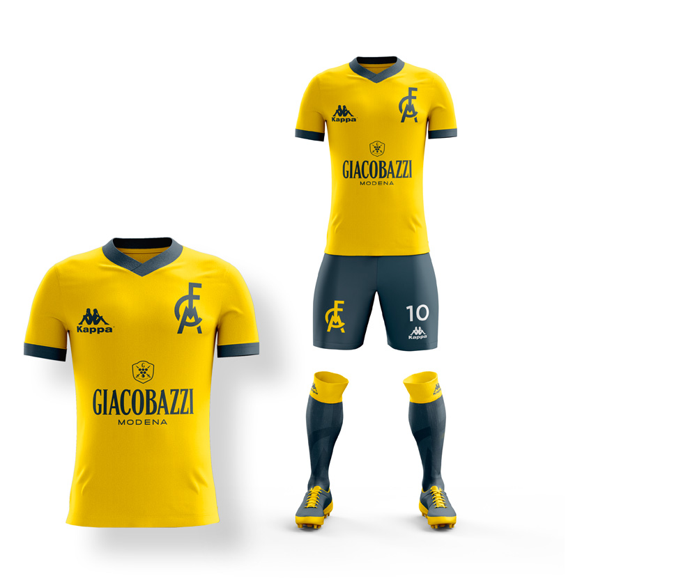
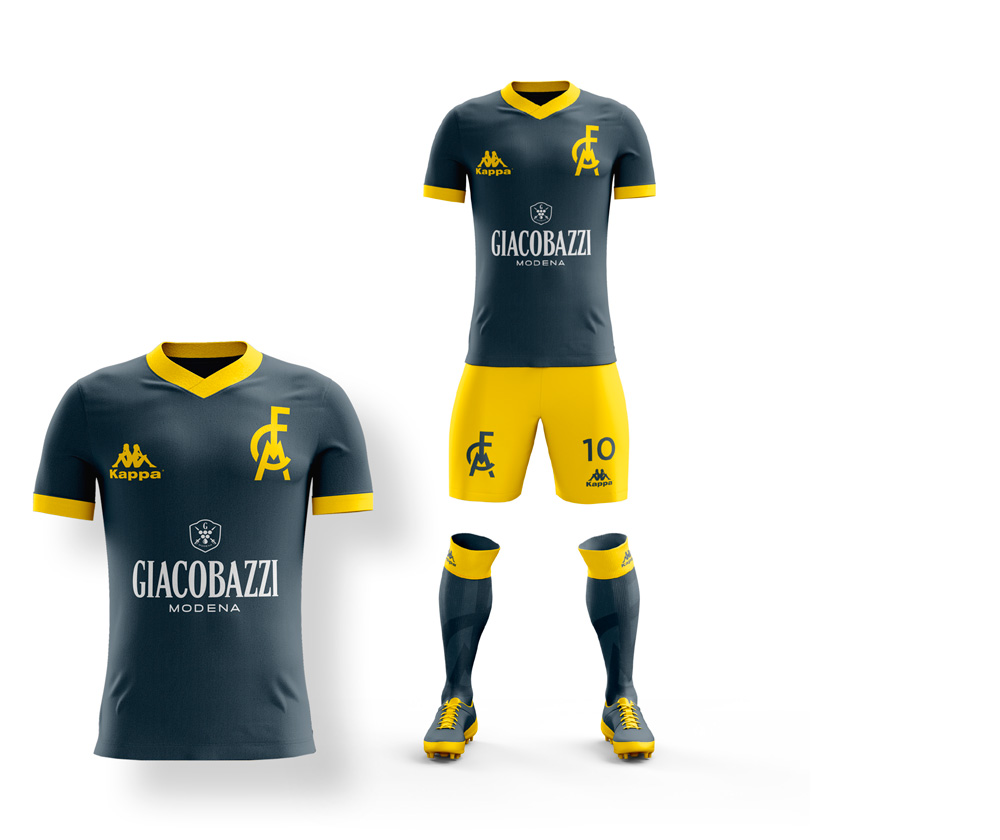
The Brand Concept for Modena Fc starts from cromatic choice between tradition and innovation, focused on yellow and blue obviously. The tones are “opacified” on purpose, in contrast with the bright ones of the past, in order to symbolize the hard football history of this club.

Modena FC,The official colors of the logo. Canary yellow, a slightly dulled Prussian blue, together with a bordeaux/red and a charcoal grey that will be used in the goalkeeper jersey and in the writing's font.

New colors wered added as well, such as red, often used in the goalkeeper’s jersey in the recent past. Black and white are used as a reinforcement for standard graphic elements present on the t-shirts such as numbers, names and sponsors.
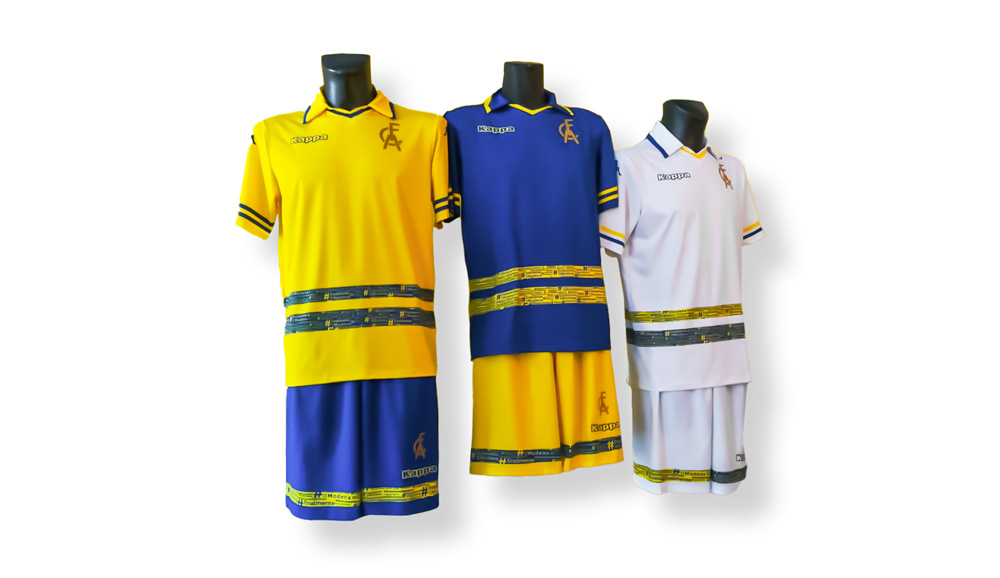
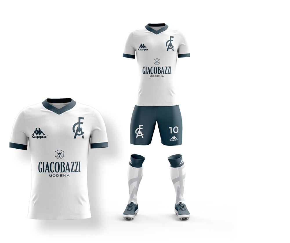
The new t-shirts

New t-shirts' concept. These are the new Modena FC t-shirts.

The idea of creating a jersey with an essential style, devoid of graphic elements comes from the intention of going back to the roots of the club. Together with the necessity of emphasising the new brand, versatile and suited to any piece of clothes.

Modena FC maglie storiche. Due foto di repertorio di vecchie formazioni Modena FC, al centro il nuovo concept di maglia studiato sulla base dei vecchi modelli del passato.

The details

Only a few details to embellish the main colors present on the socks and the jersey. Low collars that are blue like the shirt sleeves, FCM embossed on the blue socks.

Modena FC, shirts sketch. A few sketched ideas on the home jersey of the future Modena football players.
Collar and sleeves details. The collar and sleeves' edge is yellow or blue, in contrast to the main color of the t-shirt.

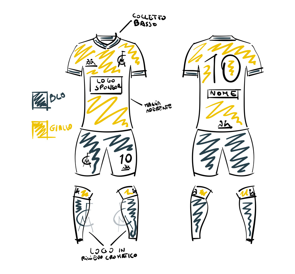
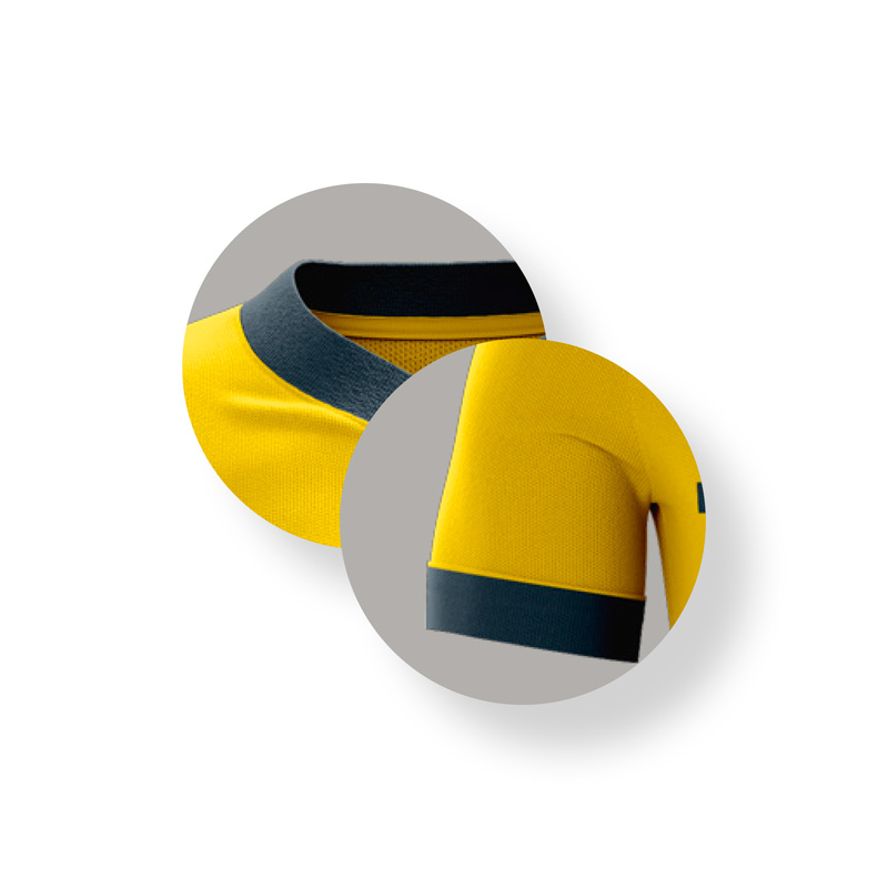
Blue edge of the collar and the sleeves.

Details of the Modena FC logo and the sponsors. They are all in chromatic contrast to the the main color of the t-shirt that can yellow or blue.

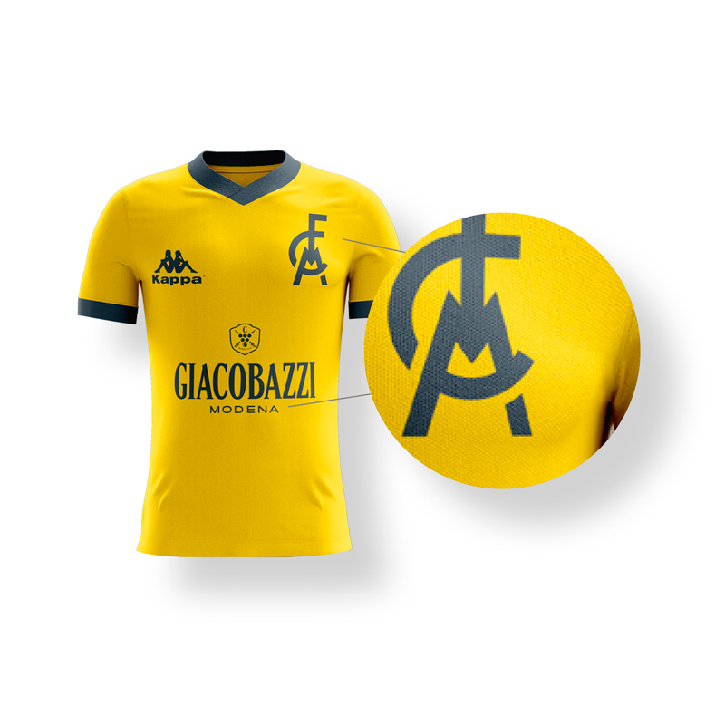
Both the FCM and Kappa logos are blue, in contrast with the background color and without white edges, just like the main sponsor on the t-shirt.

Detail of the sock, a filigree band with the writing MODENA FC embossed over the sock diameter in its upper part.

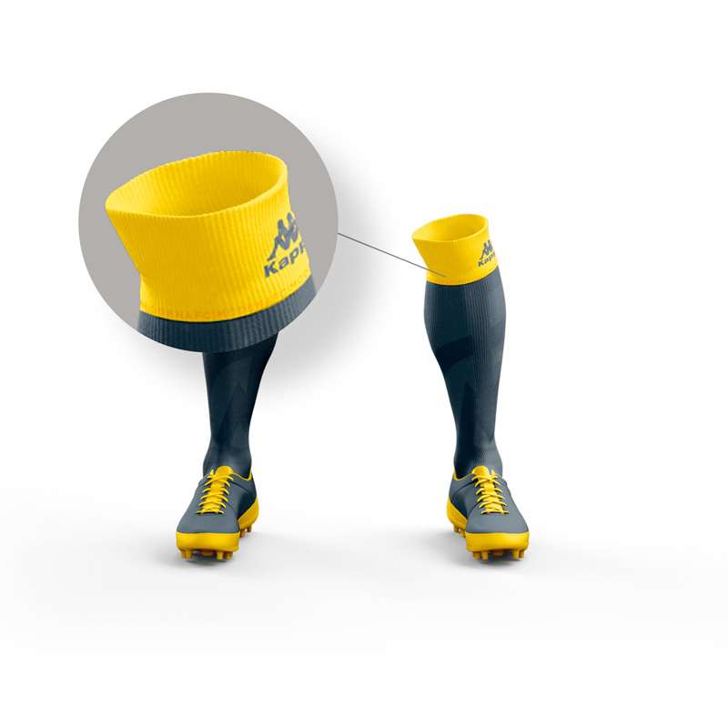
The “MODENA FC” writing embossed on the yellow edge of the sock.

Detail of the sock, with the embossed logo. On the main part of the sock sliglhtly comes up the logo Modena Fc.

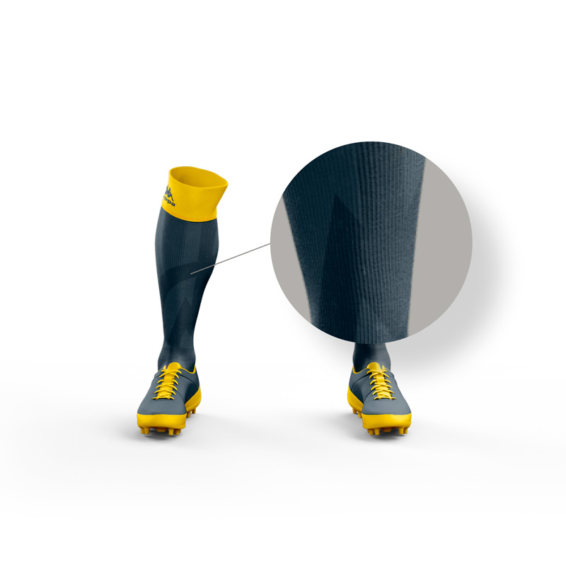
The FCM embossed and in contrast to the blue background of the sock.
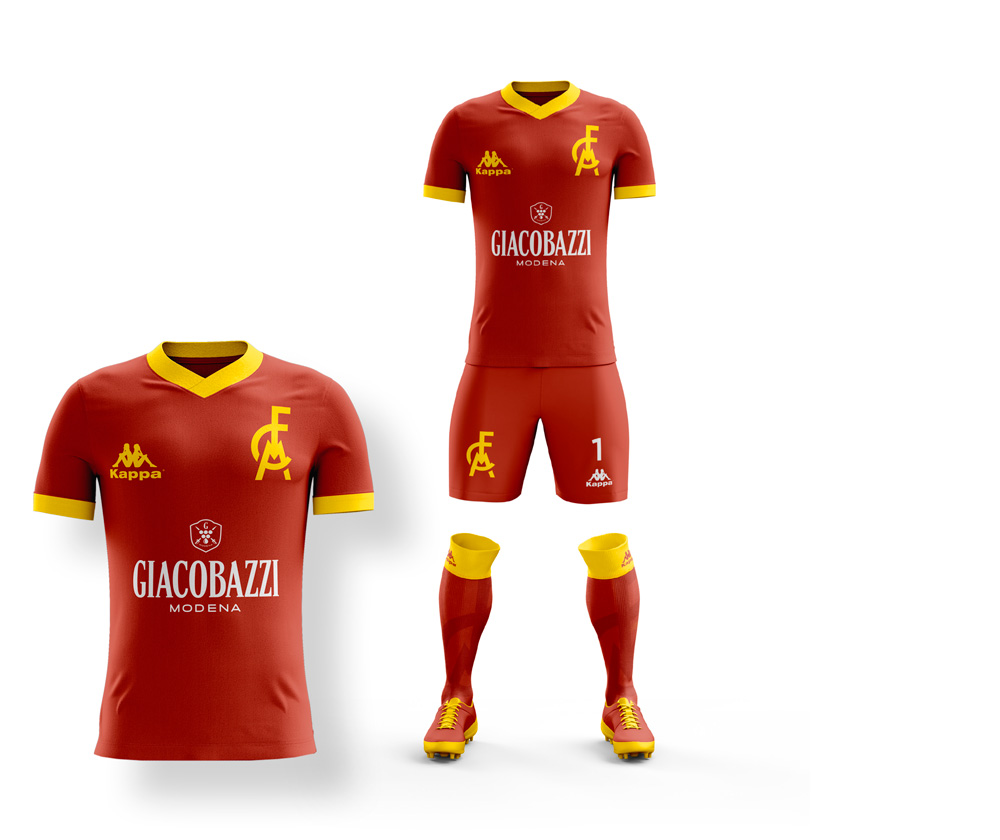
The Modena FC home jersey. The classic jersey with a yellow t-shirt and blue shorts. Blue collars, logo and details as well.
Home jersey
The Modena FC away jersey. Blue t-shirt and yellow shorts with yellow sleeves details and logos as well.
Away jersey
Third Modena FC jersey. White t-shirt with blue details, blue shorts with white details.
Third jersey
Modena FC goalkeeper jersey. Totally red with yellow logos and yellow details on sleeves, collar.

Goalkeeper jersey

Thanks for your attention! If you’re interested in fooball projects you might like the Restyling of Sassuolo FC Brand, the illustrations of the “Phenomenons” and “Football rebels” projects.


Ca’ Rossa Logo

The realisation of the Ca’ Rossa Logo was born to give new life […]

Modena FC Brand Concept

As a graphic designer from Modena, the idea of working on a concept […]


The “Imperfect Heroes” project

Imperfect Heroes is one of my favourite projects, which I was able to […]

Pin It on Pinterest